
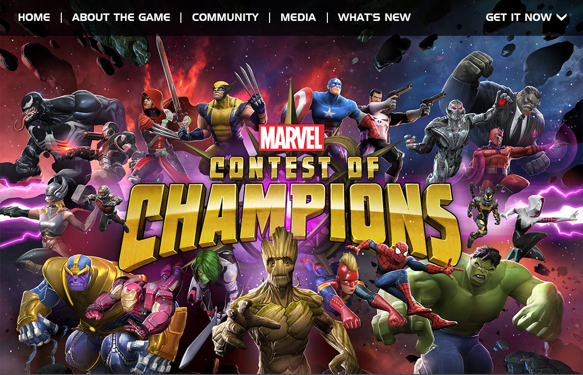
I worked on this project in 2014 as a visual designer in the marketing team. I designed the launch website, storefront and social assets, as well as static and video ads for this official Marvel IP game.
The biggest names from the Marvel Universe are ready to battle! Prepare for epic versus-fighting action with your favorite Marvel Super Heroes & Super Villains in the ultimate cosmic showdown! Spider-Man, Iron Man, Wolverine & more await your summons to battle! Assemble a team & begin your quest to become the Ultimate Marvel Champion!
Working on the launch site for Marvel Contest of Champions was a great experience as there is a plethora of information that needed to be organized and presented to the viewer. After gathering the requirements and content from the marketing and game teams, I then worked on wireframes before creating the final high definition mockups.
Click into any of the images below for more thoughts behind the design.
This website was going to be a live website with additional blog updates so we wanted to be able to promote content easily and clearly. This led to the decision to use full screen hero images as this was not only an increasing design trend and but it would also be a good experience on mobile and desktop views with easily surfaced content.
The call to action is clear and the treatment allows it to be visible regardless of the content. This is a floating element so that however the image is cropped when being resized, the CTA will still be located in the same location.
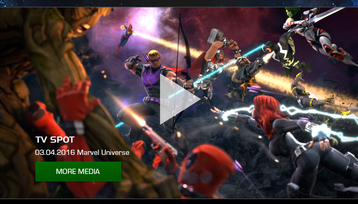
Similarly to the top hero image, we also wanted to promote the various media we had for the app. I kept the layout the same as the hero image for UX consistency. If you would like to see the front page in its entirety, you can click here.
Clicking the 'Read More' button of the home page will bring the user to the "What's New" page which has the full articles. There are three different types of articles about new releases, new characters, and promotions so I subtly color coded each post as you can see also in the "Recent Posts" category.
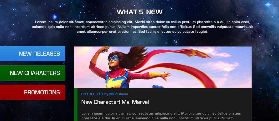
Above was an earlier exploration where I thought it would be good to be able to sort for the types of articles the user wanted to read, but later realized that this would surface less content at a glance. If you would like to see the "What's New" page, you can click here.
I was also responsible for the storefront assets which includes the app store icon and screenshots. One way of deciding on the design direction to take with this is to come up with ads of a wide variety of visual styles. Below are some of the ad graphics that I worked on.
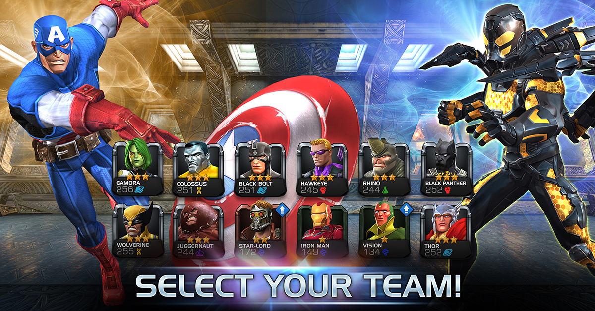
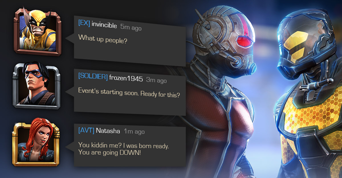
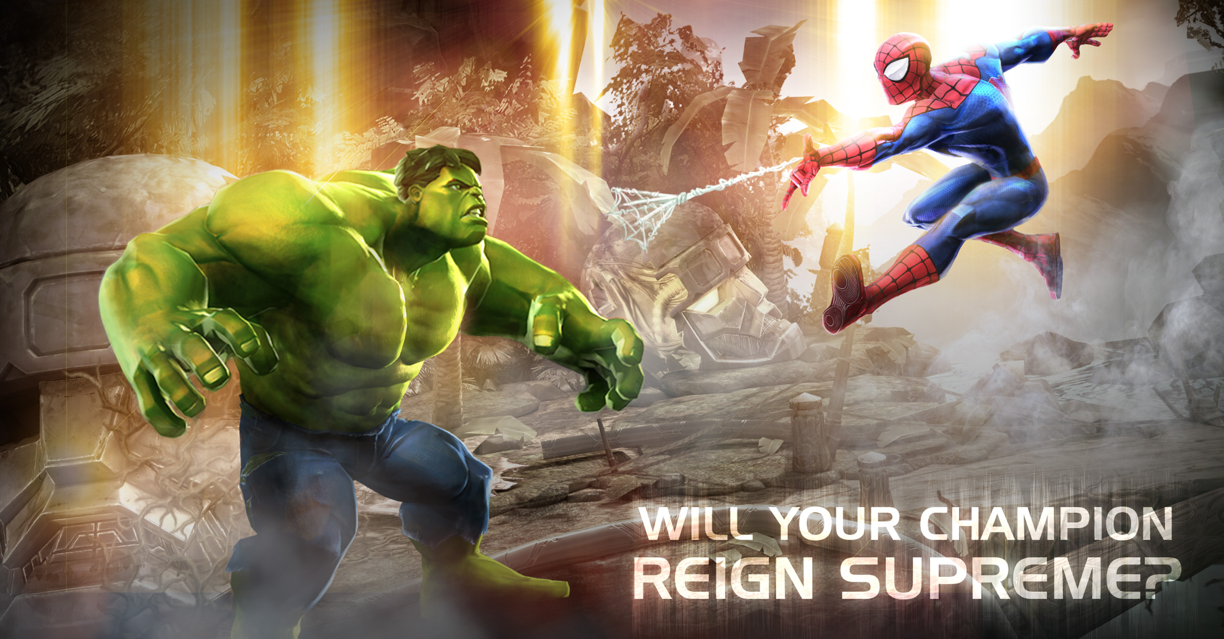
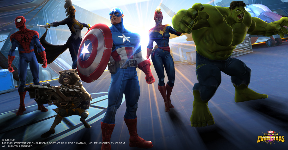
We then tested these ads in order to find the best performing styles (i.e. showing in-game UI or not, versus or team play, different color schemes) to apply to our storefront graphics. This kind of data-driven decision allows us to curate an experience that excites new players as they are ushered through the funnel and into the game. Marvel Contest of Champions actually has a Cost per Install (CPI) that is 40% lower than the industry average.