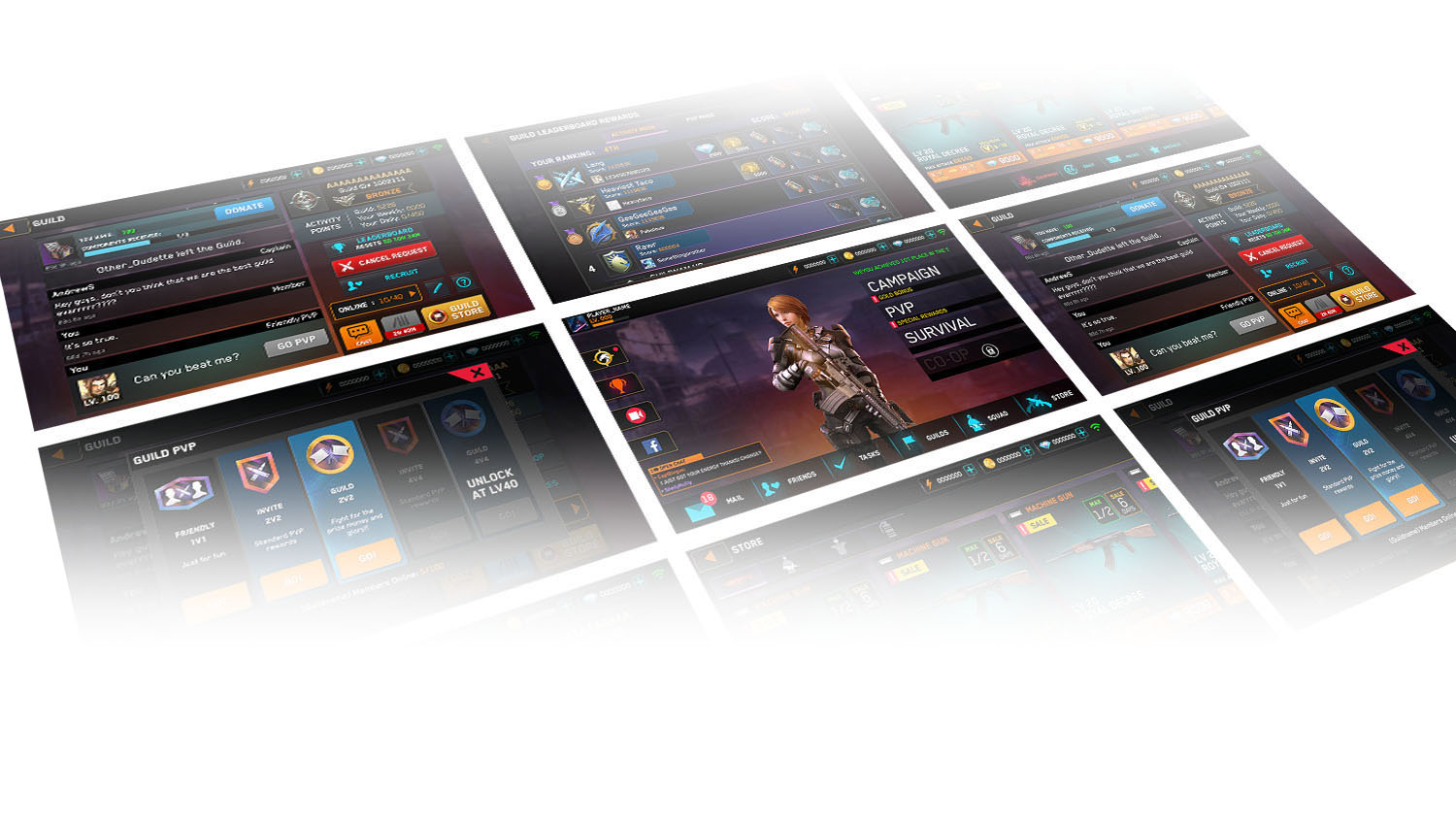


I joined the project in 2016 as a UI/UX Designer. I worked on improving the user experience by first redesigning the visual style and overhauling the guild/social features of the game.
Rival fire is a cover based shooter on mobile! Dominate in real time Death Matches, battle it out in Survival mode, or dive into our action packed Campaign mode! Recruit squad-mates and build out your arsenal. Gear up and battle friends around the world in real time multiplayer!
Our team was brought onto this project to improve the game's performance. As the main designer on the team, I first identified the problems with the visual style and consistency and designed a new style guide for the game. I updated all old and new UI to follow this new standard and working with the game designer, I also developed new social features such as friendly guild pvp which improved the DAU (daily active users), LTV (lifetime value), and user rentention.
Click into any of the images below for more thoughts behind the design.
Problem: Prior to setting the styleguide, the game had a lack of readily understandable information. There were greyed out buttons that looked disabled when they weren't actually disabled, and the same mustard colored button was used for navigation tabs, sorting tabs, purchase buttons, and more.
Solution: I defined the purpose of each color and applied this across the entire game, resulting in a more informative and easier to understand user interface. The examples below are a few of the optimizations I made in the game.

Before my update, almost all the buttons were khaki colored which was both unappealing and confusing. For example, why was the purchase button the same as the navigation buttons on the bottom of the screen? I changed the bottom navigation tabs to match the style of the top navigation tabs in order to show at a glance that they were navigation type buttons.

I also updated all the khaki buttons to match their respective functions. Blue for any progression that involved items, orange for progression that involved social aspects, gold for anything related to spending currency, grey for inactive, etc.

With this visual language established, it becomes easier to parse the information on each screen. This reduces the mental load of the user in understanding what to do next and as a result, makes the experience smoother.
This is the home screen after I applied the design decisions from the styleguide I made. However, you can see in the screenshot below that I made a number of other changes to achieve the current cleaner design. I reduced the footprint of both the top and bottom navigation and made sure the design treatment was consistent. Hoever, the biggest change is in the consideration of the UX and information hierarchy.

Originally, the mail icon was put alongside many event icons which didn't make sense, the leaderboard button was a triangle shape, and both the record & facebook buttons were taking up a lot of space. There was also an extraneous Events button in the bottom navigation that contained all the event icons that were floating above.
I redesigned the left menu from the ground up, giving everything a consistent button type. I then designed a new event icon that would contain all the current events. I removed the text for the record and facebook button which were both relatively redundant information. The end result was a much cleaner experience.
This was probably one of the big features that we revamped while working on this game. One of the biggest features that helps retain users is the ability to interact with others and experience a community. The game did have a guild feature originally but it was underdeveloped and under-utilized. Together with the game designer, we updated the guild feature to a more robust feature.
Problem: There was little interaction available between guild members and a lot of hidden or confusing features.
Solution: Along with style changes, I also reorganized the layout to reflect a hierarchy that puts greater emphasis on the functions that increased user engagement including the chat function, the guild pvp, and leaderboard functions.

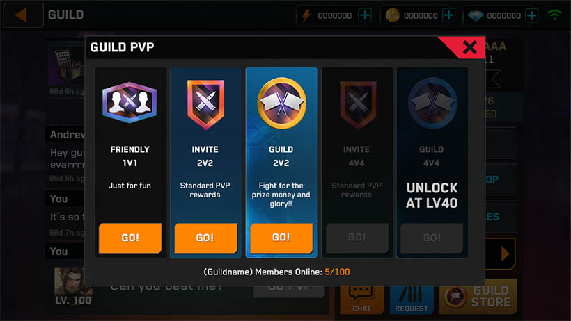
In addition to improving the intra-guild experience like improving the chat system, adding a trading system, adding a friendly pvp mode, and improving the leaderboard and guild store experience, we also created a brand new feature called Guild PVP in order to add an inter-guild experience!

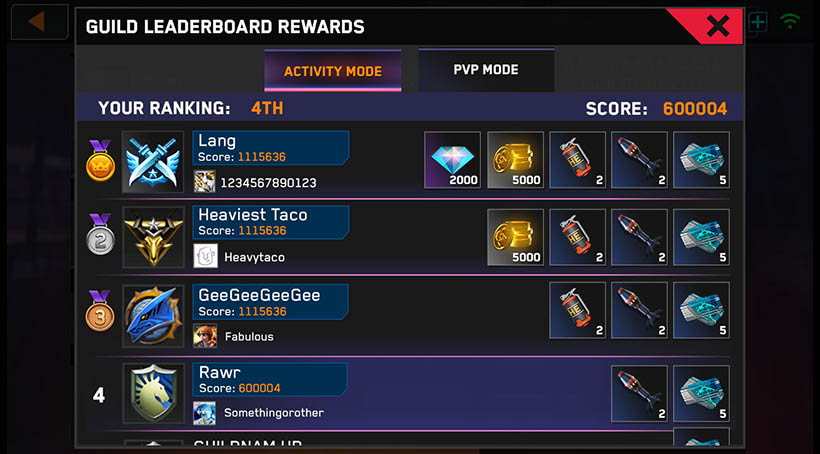
The previous leaderboard was under-utilized and only there to show the rewards for each rank, but they didn't provide any way to promote social behaviours such as letting the user know who was in first place, what were their stats, what's their profile, could I challenge them to a game, etc. I worked together with the game designer to revamp this entire screen which you can see the results of below.
